1.
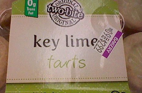
Key lime farts? I had those for days after visiting the Florida Keys.
Unless you’re a graphic designer, you probably don’t think about font typefaces very often. Maybe you have a favorite font that you use when drafting documents or writing an email, but good old Times New Roman rarely sends a negative message to the reader like the ones used in this gallery. Poor spacing and bad font choices turned the signs in this gallery from totally boring, benign advertising messages to really dirty sentiments instead. Read on to see them all, but keep in mind that some may be NSFW because they look absolutely filthy at first glance!
2.
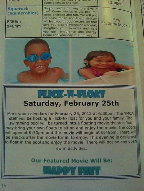
Now that sounds like fun for the whole family.
3.
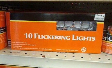
Ah, there’s nothing better than admiring the twinkle of hundreds of fuckering lights on your Christmas tree.
4.
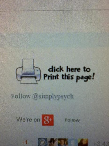
That can’t be right, but if the sign says so… *unzips*
5.
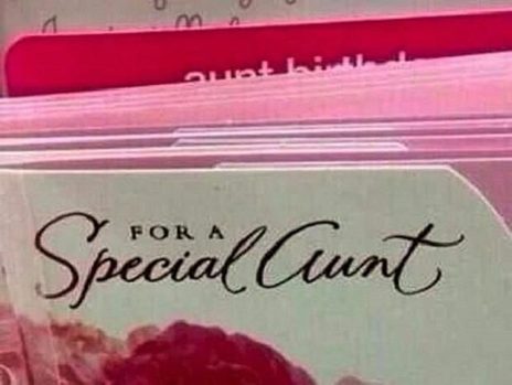
For a very special WHAT? That’s no way to treat the woman who sends you a 12 pound fruitcake every Christmas!
6.
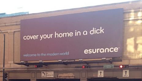
I’d really rather not, but thanks anyway.
7.
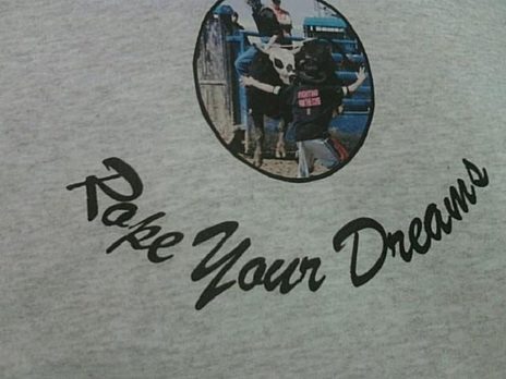
Wait, what am I supposed to be doing with my dreams?!
This one is so bad that I can’t even figure out what they were .
8.
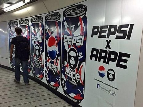
See, I told you Pepsi was bad for you.
9.
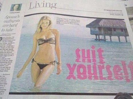
Good thing she’s wearing dark bottoms, eh ladies?
10.
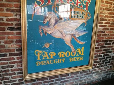
The fap* room? I think that’s what 14 year-old boys call the bathroom.
*For those who aren’t up on their web slang, “fap” is an internet word for masturbating. The more you know!
11.
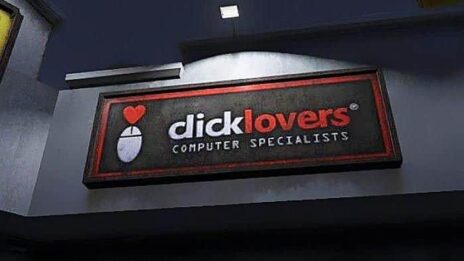
Well, I wouldn’t say I love them, but they’re okay I guess.
12.
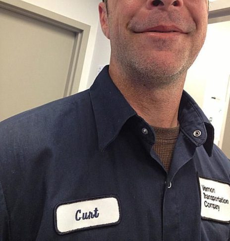
Sucks to be you, man! From now on, let’s just call him C-man.
No, wait. That’s not better; in fact it might even be worse.
13.

The most popular shop around!
14.
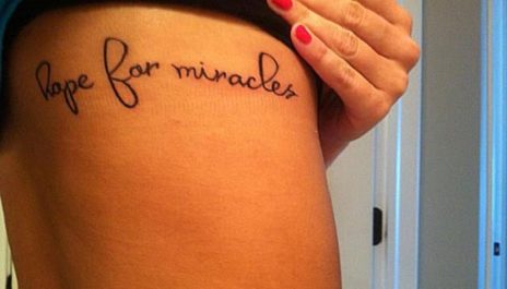
This might not technically be spelled wrong, but that font still puts it squarely on our list of truly regrettable tattoos.
15.
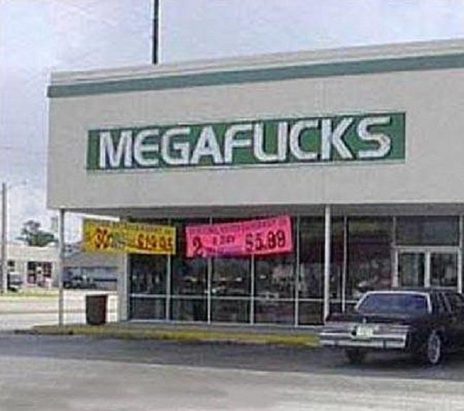
It’s hard to believe this place went out of business. Blockbuster, sure; but MEGAF**KS?
16.
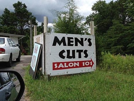
Men’s whats????
17.
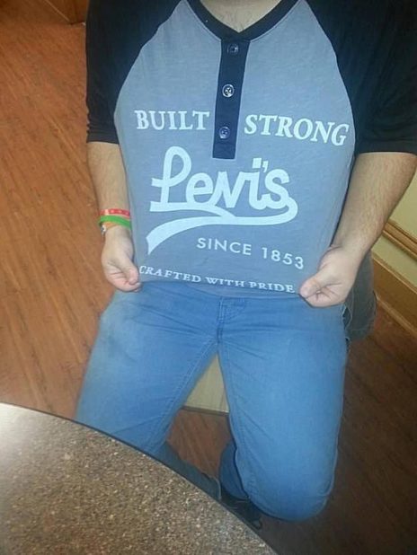
Wait for it. Waaaaaait for iiiiiit.
Yep, that’s a penis. I see it now.
18.
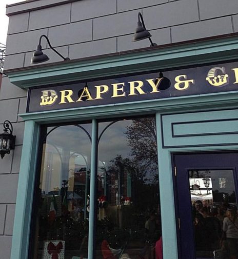
I don’t ever want to go there.
19.
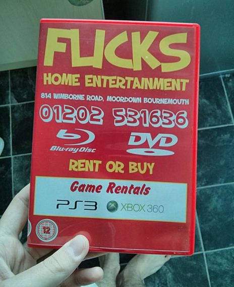
Definitely home entertainment! Keep it at home, please; nobody wants to see that.
20.
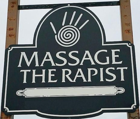
Okay, so technically this is more of a spacing problem than a font issue, but still! It reminds me of that SNL Jeopardy sketch featuring faux Sean Connery; “I’ll take ‘the rapists’ for 200, Alex.”
