Designing posters and flyers is not unfamiliar for anybody: we’ve all done it at a certain point!
Sometimes, we wanted to promote ourselves, and other times a client, but we always did it with the idea to convey an interesting message through creative design. Designing posters
Designing posters begins with a common canvas and has the usual size of 8.5-11 inch (A4), 11-17 inches, or 22 by 34 inches paper. Then, 24-36 inches is the usual size for large posters. Posters can be both vertical and horizontal, even if vertical is the preferred form.
The secret of great poster designs is not aesthetics, but the smart idea presented through aesthetics. To start with, posters need to be personal sketches, rather than Pinterest poster design ideas, so in case you want to design original event posters, spend some time on thinking how to do it.
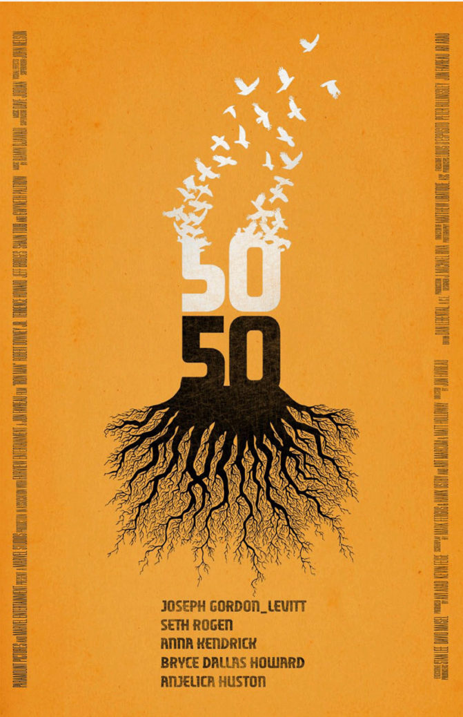
You will simply know when the right idea appears, and illustration will come after. That’s the right order of things.
Which are the features every poster should have? It should be brave, beautiful, and provocative, or even over-exiting in case you’re promoting music or events. Whatever you do, avoid chocks packed with information, and try to balance text with headlines, images, and symbols. Harmonious posters are, in fact, the catchiest ones.
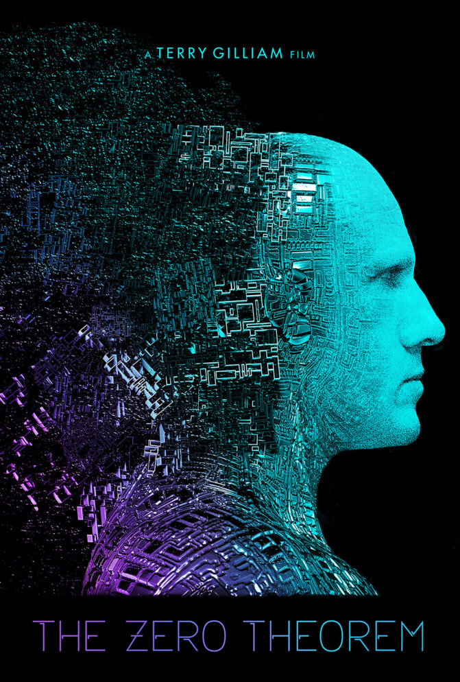
Before you start designing your poster, choose an audience and define the information you want to promote. The second critical step is to plan the reaction/mood your poster is supposed to invoke and complement it with amazing graphics and well-chosen colors and fonts.
Readable posters
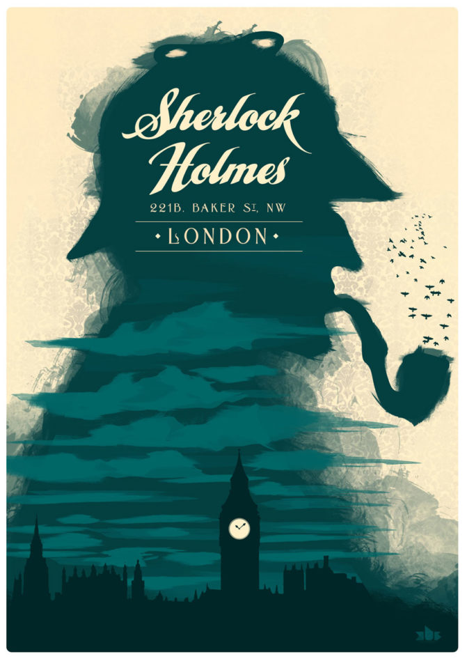
Since you’re still conveying information, make sure you’re actually exposing viewers to it. Keep important facts easy to read, put it in hierarchical order, and make sure it is visible even from distance.
Poster designers usually divide the text into three separate layers:
Headlines
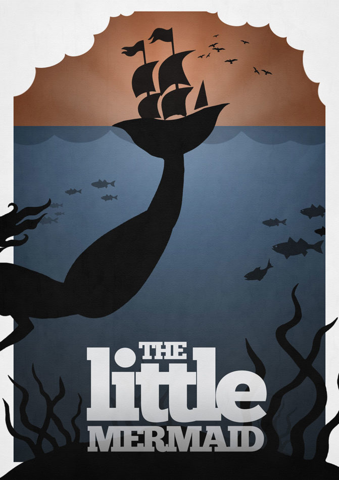
This should be the key, largest textual element you have on the poster, enriched by artistic details. Even the headline itself can play the role of an artistic detail as long as it is readable and attention-demanding; you’ve achieved your purpose.
Details
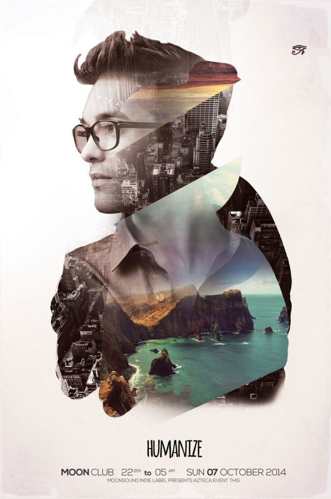
What are you promoting? When and where is it going to happen? The second portion of your text should always contain this information. Think of yourself as a viewer: which are the details you would like to know first? The answer will help you order information in a concise manner.
There are two size options that apply to this text portion: it can either drop to ½ of the headline size to express hierarchy, or be a completely separate text box with similar size, but different style and technique. Still, try to make it obvious that this is a separate text portion, and it is less important than the headline itself.
Fine prints
Do we really need to say whatever here? Movie poster examples are the best examples of fine prints, where there is additional information to be displayed in small fonts, usually in a corner where you really need to look hard to find it.
Colors in the service of energy and attractiveness
Colors are where you get to experiment the most because they serve to create the energy and mode of the poster, and they usually depend on the content of the poster. You can go with a bold solution, or something less elicit, such as subtle and romantic palettes. Literally, you can do whatever you want.
A very popular method lately is to use solid color blocks, but in case you decide to do it, make sure the box match each other, and that they look well with your striking background.
Brave contrasts
Contrasts are the most powerful tool you have to attract attention, and the stronger they are, the better the effect would be. Therefore, get rid of monotone solutions and pale gradients, and choose brave solutions between your text and your background. Posters somehow justify what is ‘unthinkable’ in other design branches, so take advantage of the opportunity!
The background is critical too. The White canvas is a safeguard, that’s true, but why not creating something unique such as full bleed background to make your poster different?
Try out typography
Fonts mean the world to a poster, even if some of you don’t think the same. Using bold sans serif, for instance, will make your poster look more serious, while italic serif is more elegant. Playful text can use a handwritten font and bold colors.
The important thing here is not to exaggerate, which is why we recommend you to go with maximum two fonts-one for the headline and one for the body.
For an even bigger impact, experiment with fonts you’ve never seen before. Choose fonts that you think are relevant to the subject matter, and inspire viewers to check the rest of the poster’s content. In case you’re experimenting with multiple fonts, we advise you to choose ones that are simple and clean.
Don’t underestimate the importance of location and size
Think about it: Where is your poster going to be displayed? This matters from many perspectives, the same as the aspect ratio and size of your poster, the surroundings, and the audience that will be exposed to your call to action.
Foreseeing the surroundings of your poster in advance is critical to creating it, not just because you need to plan how to attract attention, but also because the external factor matters to your design solutions. To be more precise: you imagine your poster hanging on a green wall, and you make it red so that there will be an attractive contrast, and people won’t fail to notice it.
Visual hierarchy
In order to be read and looked at, a poster needs to expose a lot of information in a quick and understandable way. Sounds impossible, but designers manage to do it by ranking information according to its importance. For the sake of clarity, little copies will use simple graphics and bold posters, but ones with a lot of information to display need a font that will remain in the focus. In such cases, you should also think about a big, impressive headline, and multiple chunks to divide information.
Big visuals
Every poster needs one big visual to attract attention, regardless f whether it is a photo, an illustration, or an important sentence. Something needs to dominate and to be visible even from a bigger distance.
Think tight, and choose properly among common focal scenes, novelty typography, intriguing crops, or images. The options are just endless, and what matters the most is how you’re going to layer elements, and whether there will be enough contrast to make them independently readable.
Use a shape that will attract
Shapes are also important in poster design because they serve as visual guidelines for the viewer to know where to look. You can contain text with interesting shapes, or make the entire composition uncommon-whatever you do, make sure you’re directing their attention towards the thing you want them to see, and make sure that your design is effective.
Call to action
When you show people a good poster design, that’s most often because you want/expect them to do something because of it (go to a concert, see a movie, etc). In fact, what you’re doing is designing an invitation for them, which makes calls to action pretty vital for your task. It is the same as in web design-prominence has to be present!
What is different from web design is that the call to action doesn’t consist of a single button which is easy to find, but has to be ‘hidden’ under a contact point on the poster. In order to place it right, you need to know what the user is expecting to see and to balance between that and the things you want him to see.
A clever composition
Designing a clever poster doesn’t only depend on the elements you’re using, but rather the way how you’ve broken content, and order it for viewers to see. Think of separate pieces of content as a puzzle it is you who are conveying the message, and you get to decide how it is going to be read. Obviously, take care of graphics, and the way how they interact with your text.
Dramatic and energizing
Have in mind that exhilarating and energizing elements are a brave and serious step which will definitely attract users’ attention. The question is whether such attention will be good or bad for your design, and what type of energy/emotion it is going to evoke. Drama, on the other hand, sometimes takes two words, so think well before that too.
Creative illustrations
Not every poster can rely solely on typography, or it can even happen that your budget doesn’t allow you to use it. If that’s the case, remember that creative illustrations can have the very same dramatic effect, and they give you, even more, room to experiments for the achievement of your purposes. Besides, the choice is quite admirable-you can go all the way from flat illustrations to deep and provocative layers!
Conclusion
Nowadays, when good design is a distinct advantage in almost every business, posters are returning on the scene. For quite a while, they remained behind the curtain and gave priority to web design instead, but that’s no longer the case.
Competition is harsh enough for you to look for any funnier and more entertaining way to attract attention, which is why you should strengthen your design muscles, create great poster design and get creative!
Posters are important because they are relevant for every project-whatever you’ve decided to do, posters can help you share the idea with large masses, be those your clients, colleagues, or literally anyone out here.